Introduction
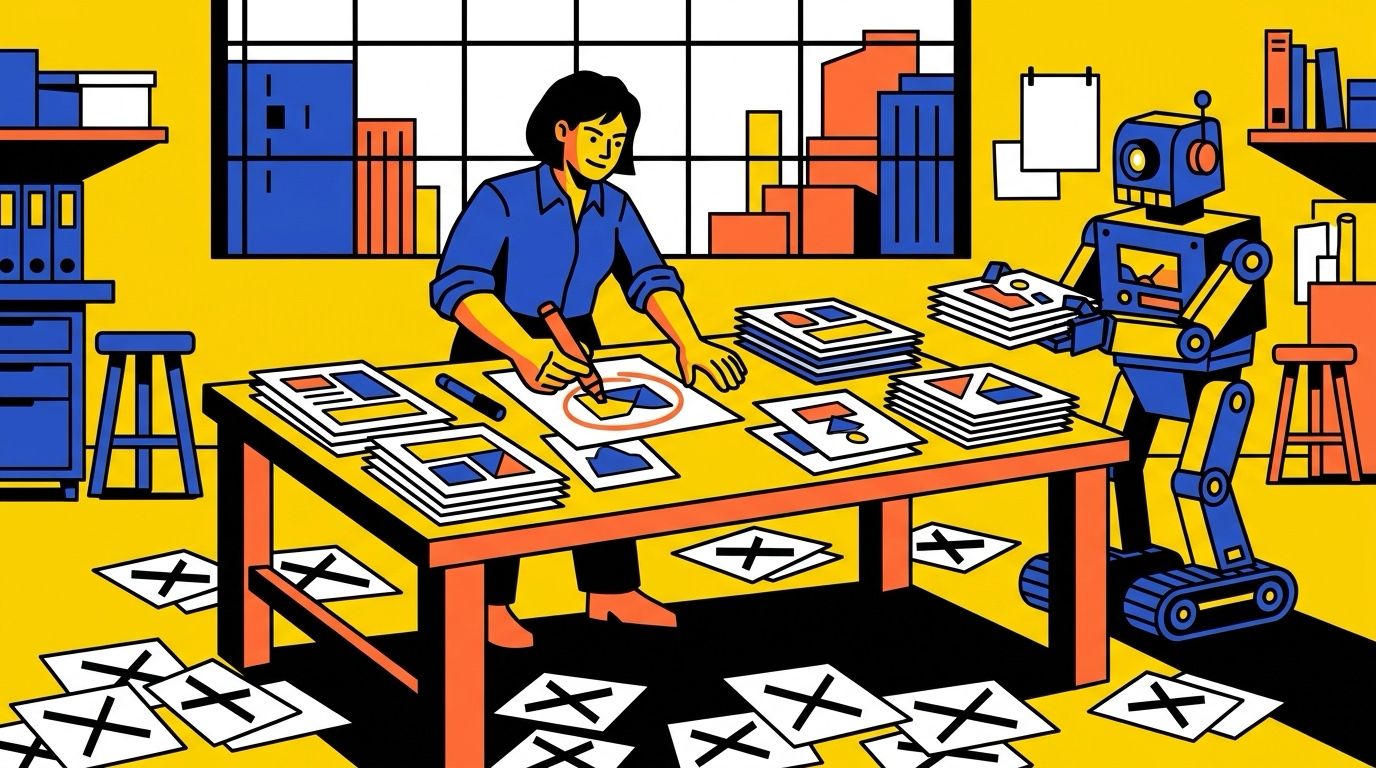
Something I’ve been thinking about a lot lately is how many people feel like AI made them worthless. If a machine can write, design and code, what’s left for us? Other people look at the flood of AI slop online and decide the whole thing is garbage.
I get both feelings, but I think both are wrong, for the same reason. We all have access to the same tools now, and they’re very good. Yet most of what they make is forgettable, and a little of it is great. It’s not the AI or the prompt that makes the difference. It’s the person using it: what they know, what they ask for, what they reject, and the feedback loop they use to iterate until it’s right.
Here’s the uncomfortable part: we humans are famously bad at saying exactly what we want. We’re vague, and when we’re vague, the AI fills in the gaps with the most average answer it can find. That’s why so much AI output looks the same. I wouldn’t call it laziness. It’s poor communication, and poor communication gets poor results.
Slop isn’t an AI problem. It’s a communication problem.
To convince you, I’d like to go over two examples that have been top of mind for me recently: a viral AI-generated music video that people swore was one prompt, and the creation process behind the site you’re reading.
Exhibit A: the P(doom) video
In late September a music video called “P(doom)” blew up. It was made with Claude Opus 5.5, and it looks like the work of a professional motion designer: big, fast type, every word landing on the beat. Press play, it’s worth the two and a half minutes.
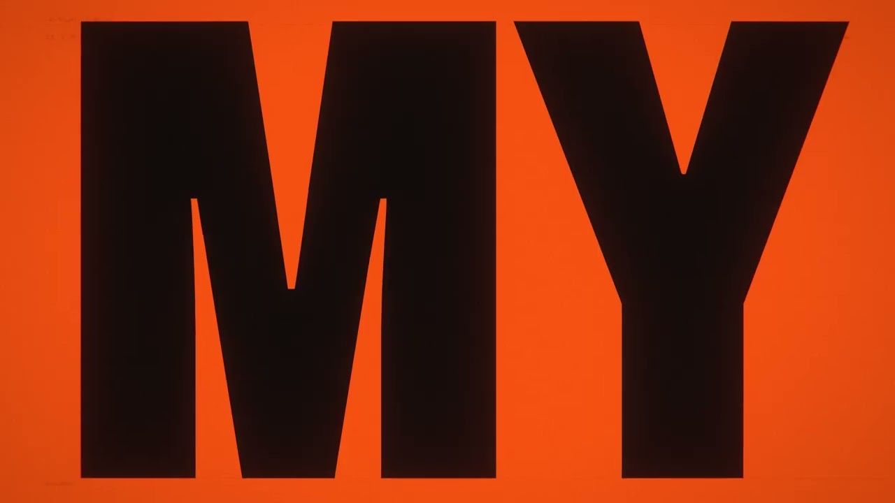
On r/singularity it passed 700 upvotes and 260 comments. The TL;DR of the internet’s reaction: this used to take a small studio, and now one person with an AI can do it. Read between the lines and the person barely mattered. Some people went further and said it was one prompt, with the AI doing the rest.
I don’t think that’s what happened. Claude did a huge share of the work on this video. But the things that made people stop and share it came from people: a song written by humans, and a director who kept sending notes until it was right.
First, the name. P(doom) is short for “probability of doom”: your own guess at how likely it is that AI ends badly for humanity. “What’s your p(doom)?” has become an in-joke in AI circles.
The song. Its lyrics were written by several people over a long time. osmarks wrote most of them in 2024, building on an opening verse and chorus by MusicPerson, with lines suggested by an online community. The music was generated with Suno. So the words, the jokes and the point of view came from people.
How the video was made. The video is by X user @_mexicat. When people claimed it came from one prompt to Opus, they answered with a thread explaining that their part was much deeper than anyone suspected. These are the parts that stood out to me:
this is not a one-shot prompt. i had a vague vision of the type of video i wanted it to be that i refined during a long conversation with claude.
there were several constraints: maximalist typography, limited color palette, not a literal rendition of each verse, lyrics always perfectly in sync with the video.
the first draft had the p(doom) indicator always present on screen with a sort of hud. i asked to integrate it more or less subtly in some of the scenes as part of the “environment”, and the video became way more visually interesting.
there were tens of small and big adjustments and changes of trajectory to get to a final version.
you get way more interesting results if you approach these tools with a director mindset.
these tools raise the floor: decent-looking is basically instant now. the ceiling is still set by having a good creative vision, at least with 5.5.
You can check this yourself. The whole project, including the code Claude wrote to render the video, is public in a GitHub repository: a shared folder that keeps every file and every change. Its revision notes back up the thread: a realistic eye removed because “the client found it uncanny,” and timings set by hand where the automatic lyric sync failed.
What I take from it. What made it good wasn’t the prompt. It was the constraints and the notes: a tight palette, rules for the type, “don’t illustrate every line,” and tens of rounds of “not like that, try this.” That’s a director at work, with a very fast crew. And notes like “don’t illustrate every line” don’t come from luck. They come from knowing how good motion design works.
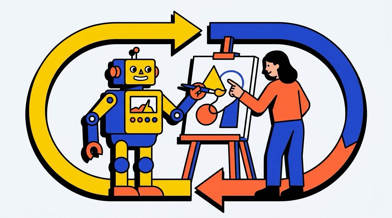
Exhibit B: how this site was built
Only recently, while writing about the P(doom) video, I realized the site you’re reading is another good example of the same thing. I built it with AI agents over a couple of days, and what made it good wasn’t the AI doing everything. It was my decisions, and the rounds of feedback in between. Two moments show it best:
1. The research. Before writing any code, I had AI agents research the options for me: frameworks, hosting, design trends, SEO. They came back with the safe pick, a quiet editorial look like a thousand other sites. I chose something louder: yellow, cobalt and a big serif headline.
2. The experiments. Later I described the motion I wanted: comic-book halftone dots, a header that shrinks as you scroll, text that reveals itself letter by letter. Then I asked Claude to push back and pitch its own ideas. It threw the kitchen sink at me. Dozens of options, some great, most wrong for this site.
This is the part that got me excited. AI made experimenting cheap, so instead of picking one idea and hoping, I could try nearly all of them. Every idea went live on a throwaway copy of the site, and I judged it on the real pages. I threw out most of them and pushed the rest toward the balance I wanted: lively, but never in the way of reading. My notes were blunt. The first dots made the text harder to read. One round was “way too much… basically unusable.” A flashy reveal on the big headings “screams too much,” so a quiet one on the small text shipped instead.
Notice what I used AI for: research, pushback, questions and options. The agents built every version and checked each one for contrast, accessibility and layout shifts. Every decision was mine.
Those decisions came from 13 years of building for the web. I could tell the first dots hurt readability because I’ve spent years caring about accessibility. Without that background, I’d probably have kept them, because nothing about them looked broken at first glance.
Looking back, what excites me isn’t the site itself. It’s this new way of working. I wasn’t even building it full time. I was busy with other work, and the site moved forward in the background, one round of notes at a time. AI didn’t replace my judgment. It gave my judgment far more to work with.
I kept a few of those experiments around, the good ones and the bad ones. If you want to feel what that process was like, you can play with them yourself:
Where you come in
If you’ve been feeling like AI made you worthless, I hope this helps a little. It didn’t. It made the parts of you it can’t copy worth more: knowing what good looks like, noticing when something is off, and being able to say why.
For me, AI has become an extension of my skills, not a replacement for them. It made me faster at everything I already knew how to judge: design, code, writing. But it didn’t know what I wanted until I told it, and it didn’t know something was wrong until I said so. That part is still on us. When we stay vague, or skip it entirely, that’s when we get slop.
That’s also why AI doesn’t replace know-how. It multiplies it. The people getting the best results aren’t the ones who prompt the most. They’re the ones who know their craft well enough to steer, and who use AI to do far more of it than they could alone.
If that sounds discouraging because you don’t feel you have those skills yet, I see it the other way. Skills can be learned, and AI is the most patient teacher most of us have ever had. Every round of feedback you give teaches you something too. The skills compound, and so does the edge.
If you want to try this yourself, here’s what has worked for me:
- Ask for options. Three versions teach you more than one. You find out what you want by seeing what you don’t.
- Judge on the real thing. A mockup lies. Try each option in the actual product, on real content.
- Set constraints early. The video and this site both got better because of what they weren’t allowed to do.
- Give specific notes, and say why. “The dots are too dark” is fine. “The dots are too dark, and I can’t read the text on top” is better. The reason lets the AI fix the cause, not just the symptom.
- Ask why, not just what. When the AI makes something good, ask it why it works. That’s how your own judgment grows.
Everyone has the same tools now. They raise the floor for everyone. The ceiling is still yours to set, and you can keep raising it.